The Comic Book Font
The Comic Book Font
March 2025
One random thing I learnt is that the comic book font that you see in hand-drawn style comics is actually typically done via technical lettering tools like Leroy Lettering System. I’ve been thinking of improving my handwriting and quite enjoy that “Gothic Router” aesthetic (which is used in this blog) due to its “draft-like” look, and unrefined appearance which emphasises on the informal nature of my writing. To that end I came across this lettering guide which I will probably lean on in the future.
edit: April 2025, the font is now in Google Fonts
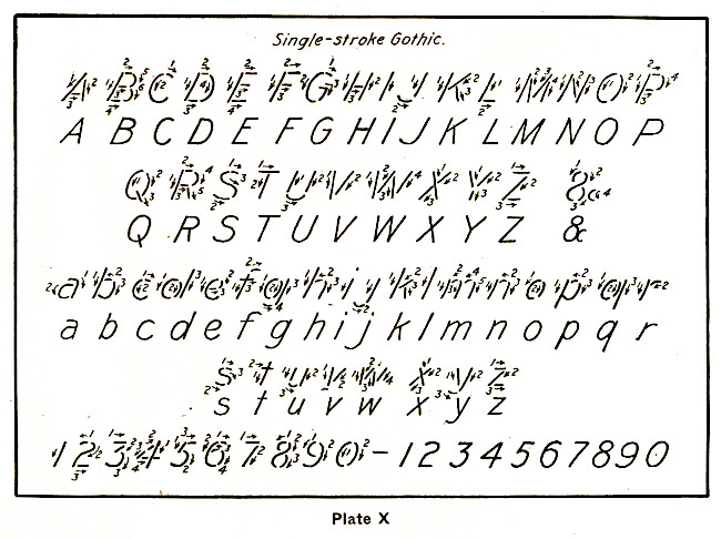
I think the only one which looks dated is the approach to the ampersand. From my perspective it would be better to do a backslash followed by the lettering of the number 8. In the future maybe I’ll modernise the above and animate it using SVG.